Meet our Layouts
Easy to use, fun and engaging – what more can we ask for?
Easy to use, fun and engaging – what more can we ask for?
3D cube layout features an interactive cube. Dragging side to side rotates the cube in the desired direction. Dragging feels very natural with precise finger tracking and no lag at all.
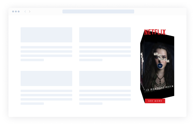
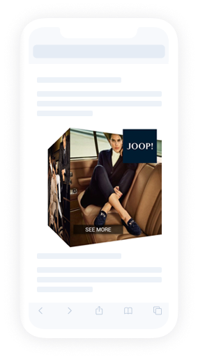
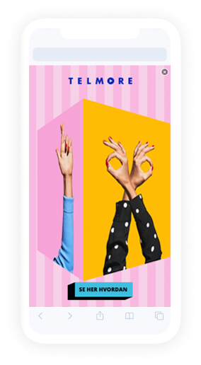
3D cube layout features an interactive cube. Tracks vertical mouse movement on the page to rotate the cube within the banner area. When the mouse hovers over the ad, rotation stops. Dragging up and down within the banner area rotates the cube in the desired direction.
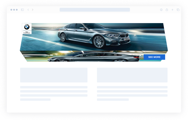
3D prism layout features a 3 sided 3D prism. Dragging side to side rotates the prism in the desired direction. Dragging feels very natural with precise finger tracking and no lag at all.
3D prism layout features a 3 sided 3D prism. Tracks vertical mouse movement on the page to rotate the prism within the banner area. When the mouse hovers over the ad, rotation stops. Dragging up and down within the banner area rotates the prism in the desired direction.

Blinds layout consist of three images that can be cycled though by dragging or tilting the device from side to side. Animation of small turning prisms is played during transition between images.
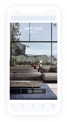
Blind swipe layout consists of up to 5 images generating a scroll movement by either swiping left or right. A gradient blinds effect is in use during the transition.
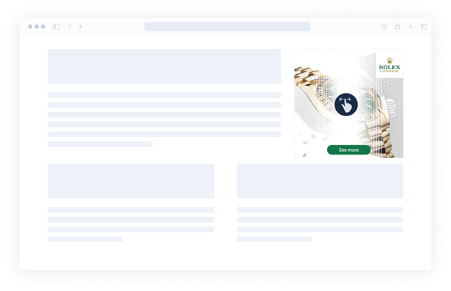
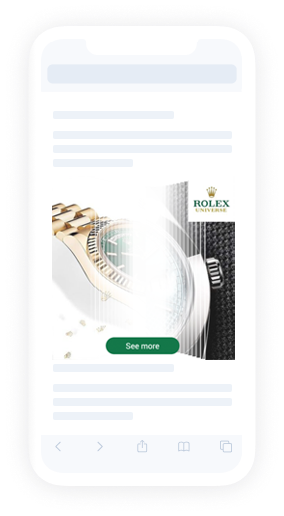
Carousel layout consists of a 3D stage which can be rotated to reveal further images (up to 35). Dragging left or right rotates the stage in that direction revealing the next or previous image.
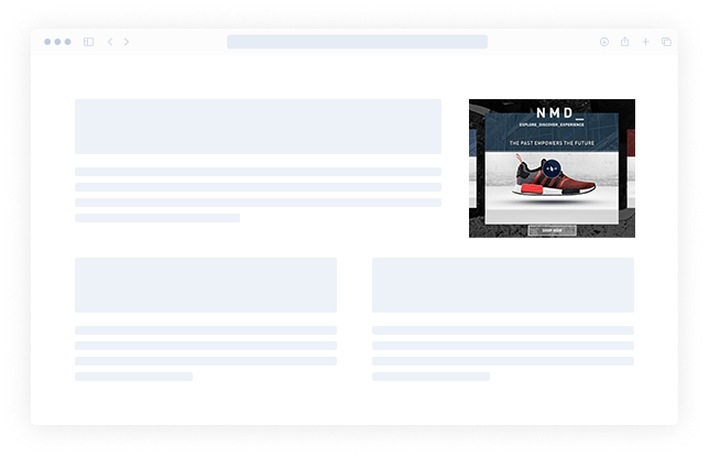
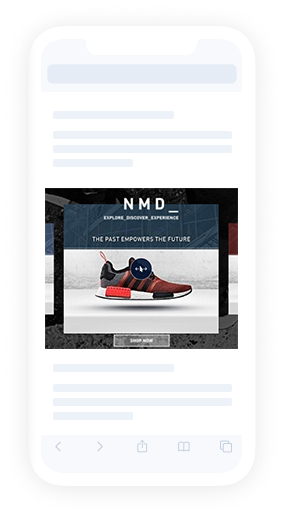
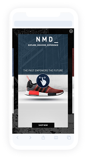
Carousel splitscreen layout consists of top media asset and carousel module. Dragging left or right rotates the carousel stage in that direction revealing the next or previous image while the top media remains still.
This layout positions & scales video and carousel depending of placement size.
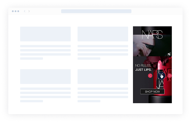
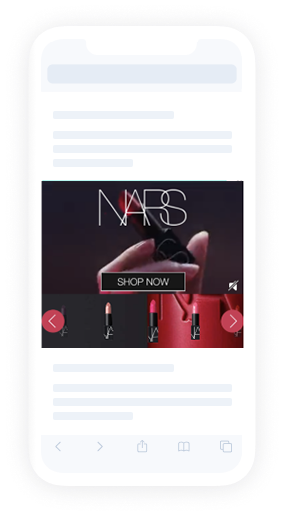
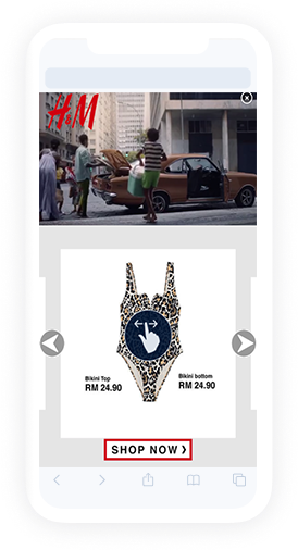
Deck of cards layout consists of multiple images (up to 35) layered on top of each other. Swiping causes the top “card” to transition to the bottom of the deck, in effect, the next card is revealed.
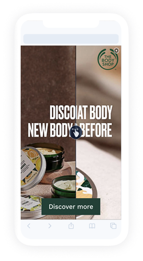
The layout consists of left and right media which user can reveal fully by either swiping to left or right.
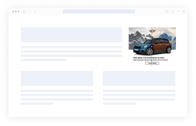
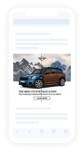
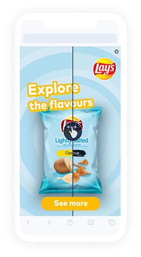
Flip layout consists of two media, such as a picture and a video. The flip layout switches in between both media types when scrolling through the center-point of the device screen.
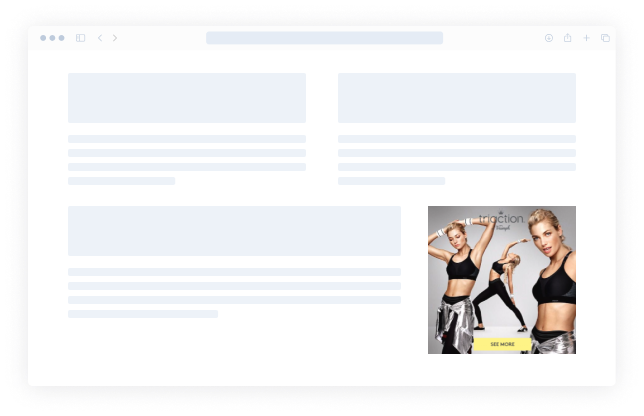
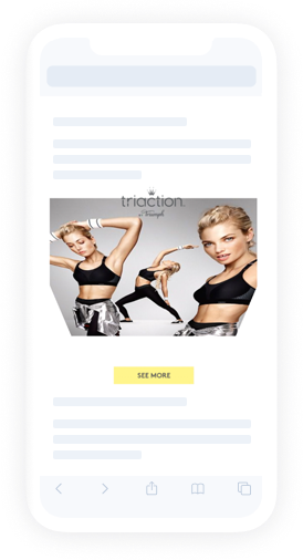
Flipbook layout consists of multiple media (up to 35) layered on top of each other. Swipe across the page to view the new image beneath. A real-time page turning animation follows the touch-point until the page below is revealed.
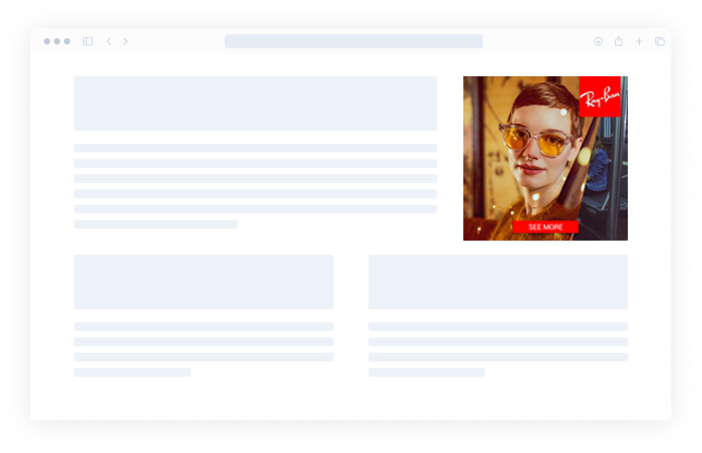
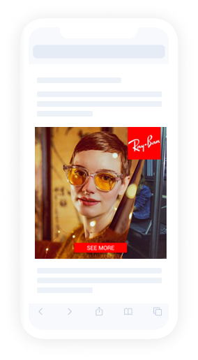
Floating layout consists of a single image that responds to either drag or device movement. Upon interaction, the image moves within the placement then creates a floating effect.
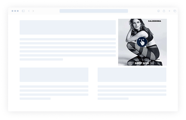
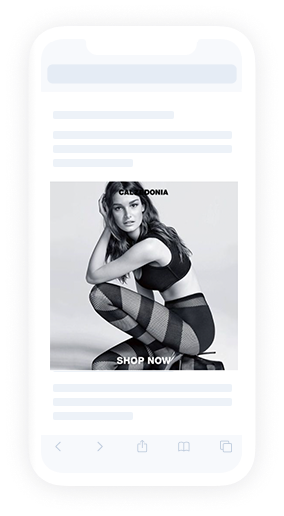
The floating object layout consists of 2 images: the background and the one that appears to be “floating” above it. The floating image responds to device movements.
For best results the floating object image should be without a background
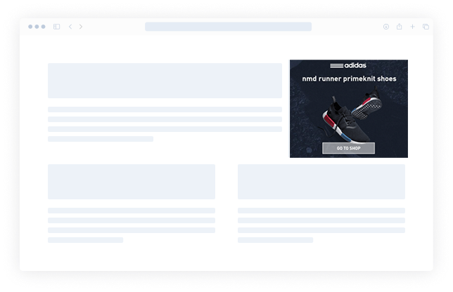
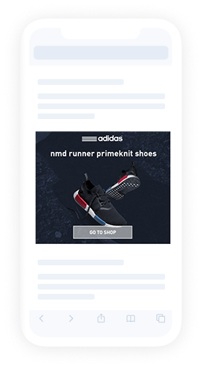
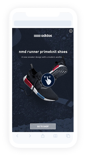
Map layout features full placement size interactive map with location pins. The map can contain multiple locations and it can be set to focus on the closest or display up to 4 closest locations in the map legend as text. The locations’ data is taken from a XLS or CSV file which contains Location title, Latitude and Longitude. Optionally, it’s possible to add overlay assets. Read more about map layouts.
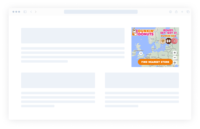
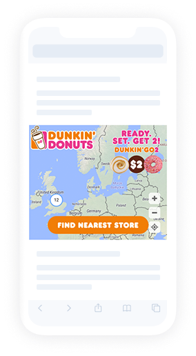
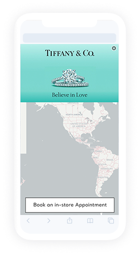
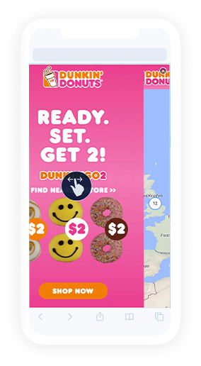
Map with horizontal drag is a layout where user first sees full placement size main media asset and can swipe to fully reveal interactive map with location pins. The map can contain multiple locations and it can be set to focus on the closest or display up to 4 closest locations in the map legend as text. The locations’ data is taken from a CSV file which contains Location title, Latitude and Longitude. Optionally, it’s possible to add a map header, parallax object, hint and overlay assets. Read more about map layouts.
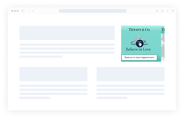
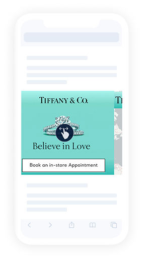
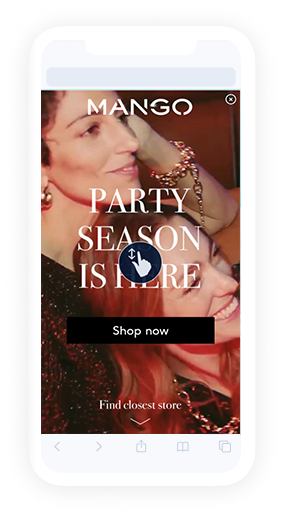
Map with vertical drag is a layout where user first sees full placement size main media asset and can swipe up to fully reveal interactive map with location pins. The map can contain multiple locations and it can be set to focus on the closest or display up to 4 closest locations in the map legend as text. The locations’ data is taken from a CSV file which contains Location title, Latitude and Longitude. Optionally, it’s possible to add a map header, parallax object, hint and overlay assets. Read more about map layouts.
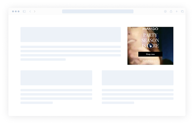
Panorama with horizontal animation for infeed layout uses a single image that is wider than the ad placement. Dragging or tilting the device from side to side causes the image to move inside the placement, creating a panorama effect.
Central area of the image is the first to appear when the ad is first loaded. Keep this in mind for offer info location and when logo or CTAs are on panorama media.
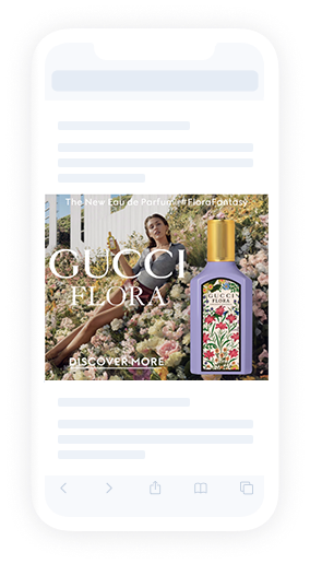
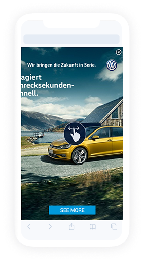
Panorama with vertical animation for infeed layout uses a single image that is taller than the ad placement. Tilting the device up and down causes the image to move inside the placement, creating a panorama effect. (As a backup can be interacted also with drag).
Central area of the image is the first to appear when the ad is first loaded. Keep this in mind for offer info location and when logo or CTAs are on panorama media.
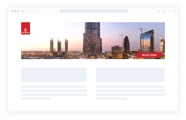
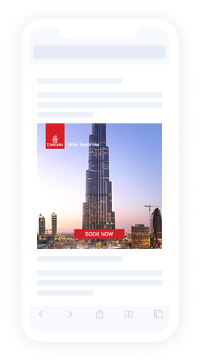
Panorama splitscreen layout consists of 2 main media assets: a wide aspect ratio panorama image in top and another media element in the middle of the screen.
Dragging or tilting the device from side to side causes the top panorama to pan with the motion while the middle remains still.

3D Parallax Cube layout features an interactive cube. Dragging side to side rotates the cube in the desired direction, with the additional assets moving at a slight delay to create a parallax effect.
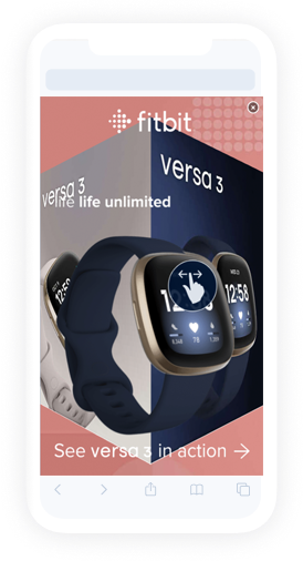
Queue layout uses multiple images (up to 35), layered on top of each other. Dragging left and right or tilting the device up and down causes scrolling through images using a zoom transition effect.
Roller layout consists of a 3D cylinder with 3 media wrapped around it, which rotates. Tracks horizontal mouse movement on the page to rotate the cylinder within the banner area. When the mouse hovers over the ad, rotation stops. Can also be rotated by clicking and dragging.
Roller layout consists of a 3D cylinder with 3 media wrapped around it, which rotates. Tracks vertical mouse movement on the page to rotate the cylinder within the banner area. When the mouse hovers over the ad, rotation stops. Can also be rotated by clicking and dragging.
Scratch layout uses two media assets that are layered, one on top of the other. The foreground layer acts as a scratchable surface, which can be removed by rubbing the screen. The bottom layer can include video.
Top layer image should include some kind of relevant call to action, prompting the user to interact with the ad. This template requires a minimum of 2 images – surface and below scratch, which supports video.
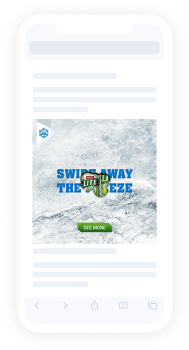
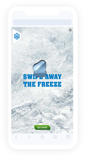
Queue layout uses multiple images (up to 35), layered on top of each other. Images are changed as user scrolls the content. Images fade to reveal the asset below.
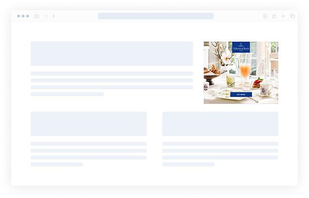
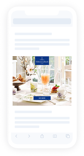
Image is zoomed out as the user scrolls through the content.
The image or video in the ad is bigger than the placement size and while scrolling the content, the ad is zoomed out and the whole image/video appears.
Slider is a sister of Drag to Reveal. The layout consists of left and right media which user can reveal fully by either swiping to left or right. By dragging to one or other side then dedicated Endcard is shown. User can go back to start by clicking reload on right bottom corner.
The slides layout behaves much like an interactive slideshow. Dragging or tilting the device scrolls through the slides.
The slides template requires a minimum of 2 images.
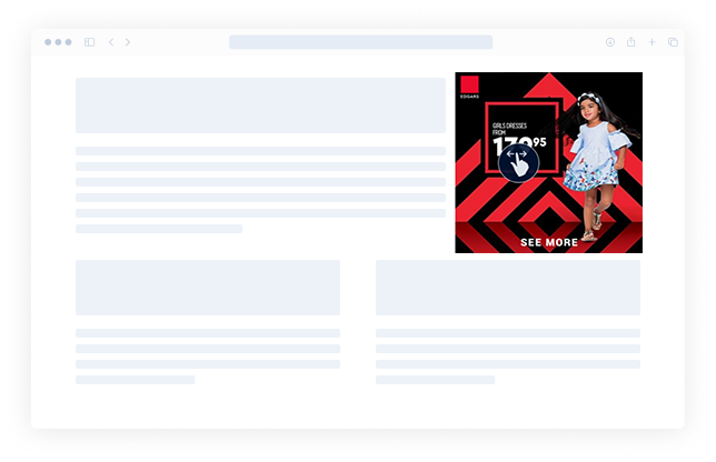
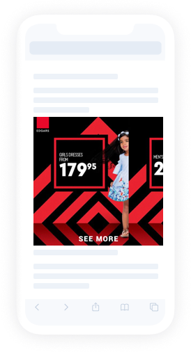
Splitscreen layout consists of first media asset and second media asset. This layout positions & scales video and images depending of placement size.
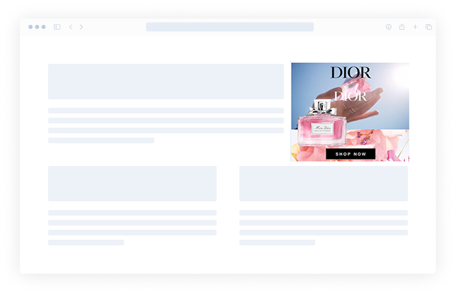
Still layout is static to gain a superior compression and load speed for image or video. A video will autoplay as it appears in viewpoint.
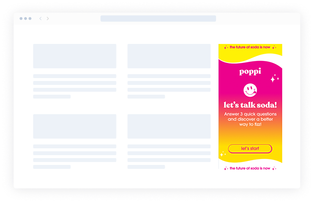
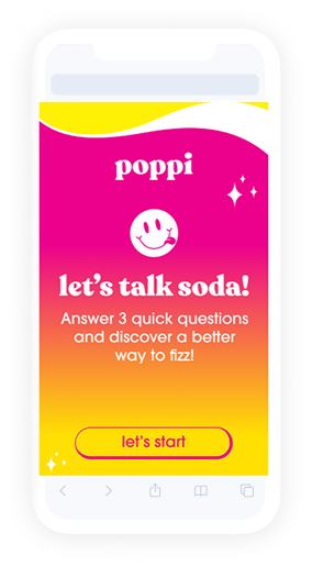
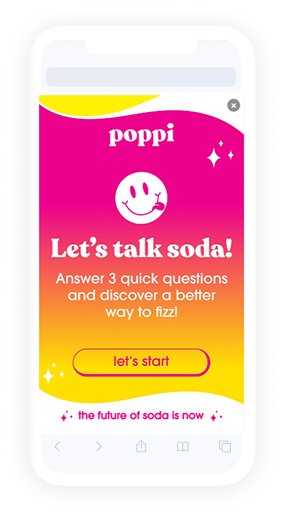
Survey is a layout that allows user to create a survey for the ad viewers. Layout consists of optional intro screen, question screens (up to 6) with answers (each question can have 6 answer choices) and end screen. Questions can either have single-choice or multiple-choice answers. No premade assets are necessary to use the layout, user can simply type in the text by themselves and style it. Read more in details.
Tiles layout features 7 main media elements: 6 at the top and 1 at the bottom. The top 6 image layers respond to device movement by flipping to reveal another image beneath.
The bottom layer, either an image or a video, remains static during the interaction.
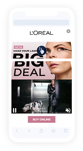
The train layout behaves like a simple swipe gallery. Swiping images or clicking on arrows changes the slides. The ad can be automated also.
The slides template requires a minimum of 2 images.
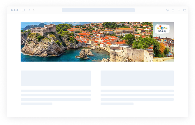
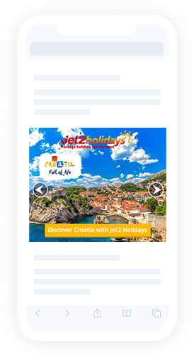
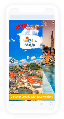
Image is un-blurred as the user touches through the ad.
The image or video in the ad is blurred and while touching the ad, the ad is un-blurred and the whole image/video appears sharp.
Image is un-blurred as the user scrolls through the content.
The image or video in the ad is blurred and while scrolling the content, the ad is un-blurred and the whole image/video appears sharp.
Video layout gains a superior compression and load speed for video files. A video will autoplay as it appears in viewpoint.
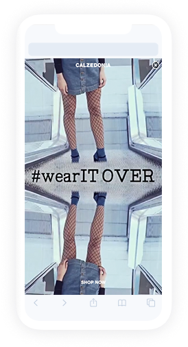
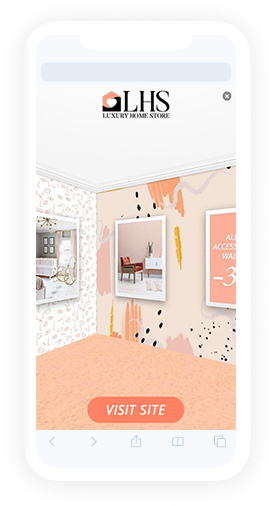
VR showroom is an interactive layout that invokes a VR feel. Dragging or pivoting the device moves viewport around a fully VR showroom.
Custom CTA can be added on each wall.
Social To DisplayNew!
Social to Display is a layout that allows user to import their Facebook post and turn it into a display ad. Data that is imported from the social ad consists of up to six image or video assets, profile image and page info such as page name, hashtags, likes and comments count. User can modify imported data by changing assets, editing texts and choosing their text color and size.